
Your Guide to Bulletproof Email Buttons that Work
If your webpage is your store, and your email is your shop window, then your call-to-action (CTA) button is your amazing window display that draws people in. Needless to say, your CTA is one of the most important parts of your email, and if it’s hard to find, hard to use, or broken in any way, your subscribers aren’t going to click!
Don’t worry, though. We’re here to help make sure your CTA buttons are bulletproof and can be seen by all customers, regardless of email client or viewing preferences.
In this blog post, we will dive deeper into the methods of crafting bulletproof buttons for your subscribers to improve the user experience—and your email campaign performance.
Here’s what you’ll discover:
- What’s a bulletproof button?
- Button design best practices
- 5 coding techniques
- Advanced enhancements
- Email client support
What’s a bulletproof button?
Bulletproof buttons are call-to-action buttons built with code instead of images. You can reliably swap your GIFs, PNGs, and JPEGs for HTML and CSS. By only using code, the button will display in all email clients even with images off, hence making them “bulletproof.”
What’s more, you can update the content and style of your buttons by simply editing your HTML template. You no longer have to waste time crafting buttons in a design tool like Photoshop, uploading them to a server, and updating your HTML.
Do not use bulletproof button images
I’m going to say this once and then never say it again. The only truly bulletproof button is an image.
I know. But that’s really the only way you can guarantee your button looks exactly the same in 100% of email clients. Because we all know how inconsistent our emails can look across different email clients, apps, and devices.
Despite this, you should never use an image-based button. Image buttons get lost when images are turned off because of image-blocking, and they’re not accessible for your subscribers who use screen readers (more on that in a second).
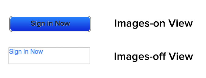
If your CTAs are contained within images, there’s a good chance that subscribers are missing out on your message. Even worse, they aren’t interacting with your campaigns.
Using image-based CTA buttons also impacts the accessibility of your email. If you’re hiding the context of the CTA inside an image, screen readers may not be able to read them, making your email inaccessible for visually impaired subscribers.
Now that you know more about image buttons, you should realize that my initial statement is only mostly true. Image-based buttons look the same in every email client where images are turned on and only if the subscriber isn’t using a screen reader. So are they actually bulletproof? No. And as both of these above-mentioned cases are impossible to track using standard email tracking, there’s no way for you to know what percentage of your subscribers are having this bad experience.
So ditch the image CTA and make sure your subscribers can see and use your CTAs no matter what device they’re using.
What makes a beautiful button design?
Buttons are more than just code though. There are several factors that go into making your buttons usable and eye-catching.
Email button shape
Make your buttons look like buttons.
We all like making fun and unique buttons, but often if you stray too far from what’s expected, subscribers will miss the intent—and not take action. Yes, the words may say something is clickable, but as they say, “A picture is worth a thousand words.”
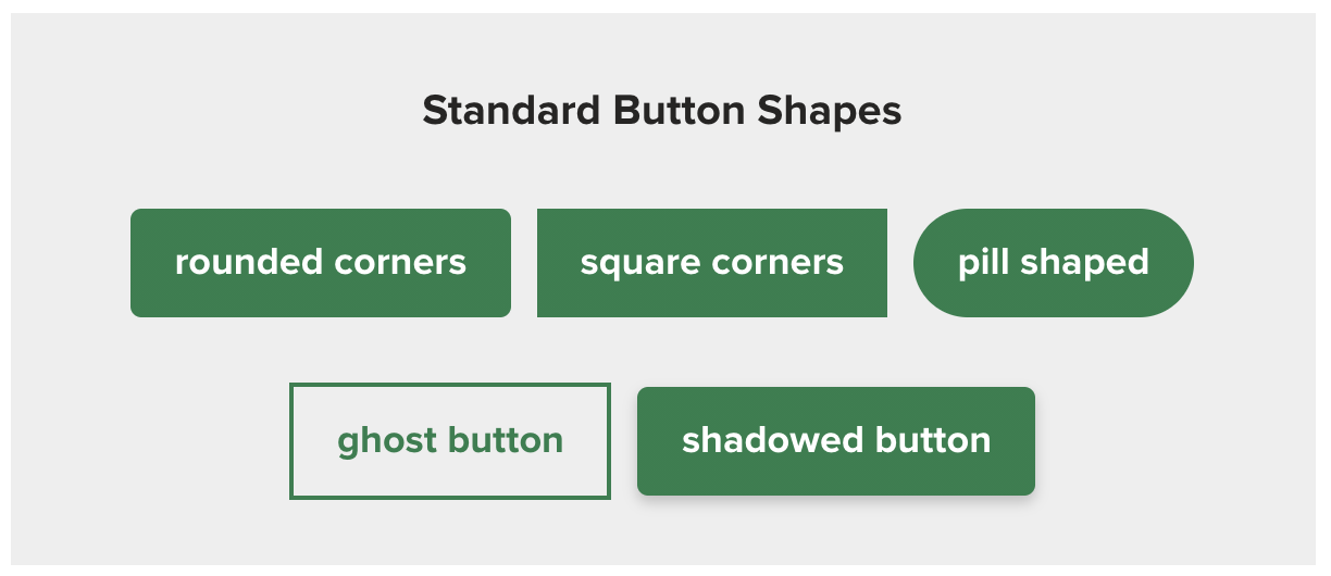
Use standard button shapes to ensure you catch people’s attention, especially if they’re scanning. Standard shapes include:
- Rounded corners
- Square corners
- Pill shaped
- Ghost button
- Shadowed button
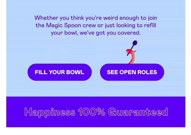
That isn’t to say you can’t do fun things with buttons. Magic Spoon added some fun animated GIFs to their buttons to draw even more attention to them.
Email button size
With over 40% of subscribers opening emails on mobile devices, according to our annual state of email engagement report, it’s important that your button is designed so it works across all devices.
If your button is too small, it will be hard to click on mobile devices. If it’s too large, it looks less like a button and more like a design element.
The ideal size for buttons for easy clicking on mobile devices has been translated to be between 42px and 72px (approximately 11-19mm). This seems about average for button height seen around the web, and the buttons we use here at Litmus fall within that range as well.
In one study that went up to 30mm, the tap-to-click accuracy plateaued at 20mm, so there’s a point where button size doesn’t make that much of a difference anymore.
Email button space and padding
Make sure there’s enough whitespace around your buttons, too, so they stand out. This also makes it easier for your subscribers to click the correct button.
The best example of this would be an email with several links in one paragraph. If you bunch your links close together, your subscribers are never going to accurately click on what you want them to click on, especially on mobile.
Visual feedback
Not every email client supports interactive emails, but where possible, adding a little interactivity to provide visual feedback helps subscribers know their interaction has registered.
It’s an extra sign to them that something is clickable.
This can be as simple as a change in color or more complex depending on your preference. (We know sometimes it’s fun to go all out, so don’t hold back—but know when to rein yourself in.)
Our own standard button has a color change as well as a push button effect.

But we did try something new, too, and had a lot of fun with our January newsletter buttons. A great design element that was also fun to “push.”
Email button text and font size
Keep your actual CTA copy or label actionable and to the point. Tell subscribers what you want them to do as clearly and concisely as possible.
1 to 5 words is usually enough.
That length also keeps your email scannable. And if you have more to say? Include it in a headline over the button. By regularly keeping CTAs within 1 to 5 words, it makes the rare moment you do go over it stand out in a much more meaningful way.
5 ways to code a bulletproof CTA button
With over 300,000 potential email renderings, is it really surprising you can’t make one-size-fits-all button styles that work everywhere?
What you can do is make a button that works almost everywhere. And there are a few different methods for creating these buttons depending on your needs. Take a look through these to figure out which one works best to support your subscribers.
1. Conditional-padding button
Thanks to Mark Robbins for this conditional-padding button. It’s the one we use here at Litmus.
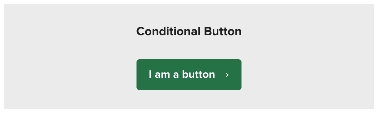
This button uses styling on the link to style it for everyone except Outlook. Then, it uses conditional code to add Outlook-specific padding and border-radius. Since the Outlook padding is controlled separately, you can edit the Outlook padding without impacting what the button looks like in other email clients.
<a rel="noopener" target="_blank" href="https://www.litmus.com/" style="background-color: #1F7F4C; font-size: 18px; font-family: Helvetica, Arial, sans-serif; font-weight: bold; text-decoration: none; padding: 14px 20px; color: #ffffff; border-radius: 5px; display: inline-block; mso-padding-alt: 0;">
<!--[if mso]>
<i style="letter-spacing: 25px; mso-font-width: -100%; mso-text-raise: 30pt;"> </i>
<![endif]-->
<span style="mso-text-raise: 15pt;">I am a button →</span>
<!--[if mso]>
<i style="letter-spacing: 25px; mso-font-width: -100%;"> </i>
<![endif]-->
</a>

| Did it work? Broken is not a good look. Prevent email errors and protect your brand reputation with Litmus Email Guardian. And ensure you send on-brand, error-free emails—every time. |
Pros of conditional-padding buttons
- There’s great support in most email clients (see table below).
- The entire button itself is clickable.
Cons of conditional-padding buttons
- It requires playing around with the conditional code and tags to get the padding exactly right in Outlook.
- The Outlook version has squared corners no matter what.
2. VML-based buttons
This traditional approach to bulletproof buttons was popularized by Stig, a developer at Campaign Monitor.

This approach uses styling on the link itself to structure and style the button for most email clients. Structure is supplied via the line-height and width properties.
As a fallback for Microsoft Outlook, Vector Markup Language (VML) is used within an Outlook-specific conditional comment. The VML creates a box around the link in Outlook, then styles the anchor tag to create the button design for everyone else.
<div><!--[if mso]>
<v:roundrect xmlns:v="urn:schemas-microsoft-com:vml" xmlns:w="urn:schemas-microsoft-com:office:word" rel="noopener" target="_blank" href="http://" style="height:50px;v-text-anchor:middle;width:170px;" arcsize="10%" stroke="f" fillcolor="#1F7F4C">
<w:anchorlock/>
<center>
<![endif]-->
<a rel="noopener" target="_blank" href="http://litmus.com" style="background-color:#1F7F4C;border-radius:5px;color:#ffffff;display:inline-block;font-size: 18px; font-family: Helvetica, Arial, sans-serif;font-weight:bold;line-height:50px;text-align:center;text-decoration:none;width:170px;-webkit-text-size-adjust:none;">I am a button →</a>
<!--[if mso]>
</center>
</v:roundrect>
<![endif]--></div>
For more complex versions of this button, you would actually create two versions of the button—one in VML and one for everyone else.
Pros of VML-based buttons
- There’s great support in most email clients (see table below).
- The entire button itself is clickable.
- Rounded corners are maintained in Outlook.
Cons of VML-based buttons
- It relies on the use of an unfamiliar language—VML—that’s proprietary for the Microsoft Office suite, which makes creating new bulletproof buttons and updating existing ones time-consuming and frustrating.
- Width and height of the bulletproof button must be declared, so any change to the copy of the CTA would require changes to the dimensions of the button.
- More complex versions of the VML button require two URLs that need to be changed. And some ESPs don’t track the URL in the VML section.
- VML requires a fixed height and width, so this button doesn’t work very well for templates where the length of the copy in the CTA may vary.
If you don’t want to learn the ins-and-outs of VML (and honestly, who does?), Campaign Monitor has a free online tool for building traditional bulletproof buttons. Buttons.cm makes it easy to craft new CTA buttons that will look great and work well across most email clients.
3. Padding-based buttons
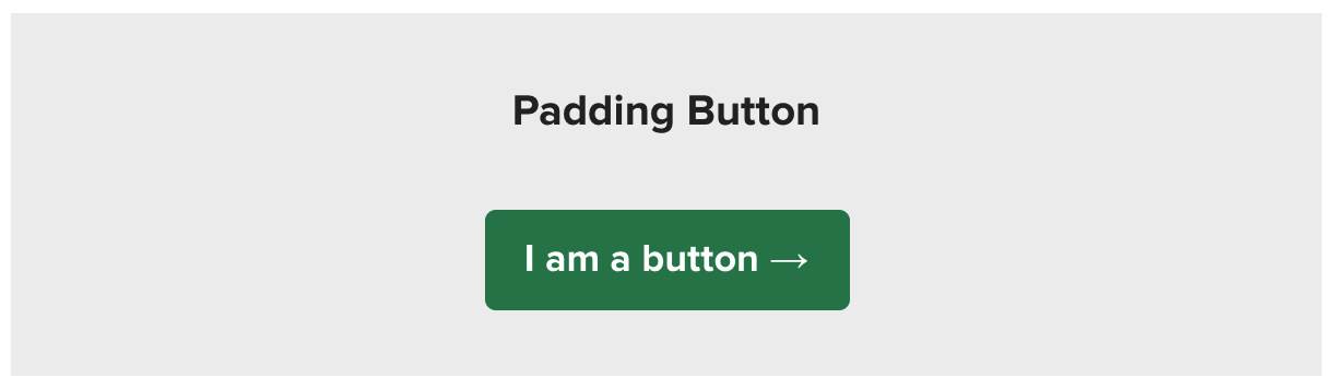
This method uses a simple HTML table for the button. It relies on padding at the table cell level to structure the button as well as HTML attributes and CSS to style the button.
<table border="0" cellspacing="0" cellpadding="0">
<tr>
<td style="padding: 12px 18px 12px 18px; border-radius:5px; background-color: #1F7F4C;" align="center">
<a rel="noopener" target="_blank" href="http://litmus.com" target="_blank" style="font-size: 18px; font-family: Helvetica, Arial, sans-serif; font-weight: bold; color: #ffffff; text-decoration: none; display: inline-block;">I am a button →</a>
</td>
</tr>
</table>
4. Border-based buttons
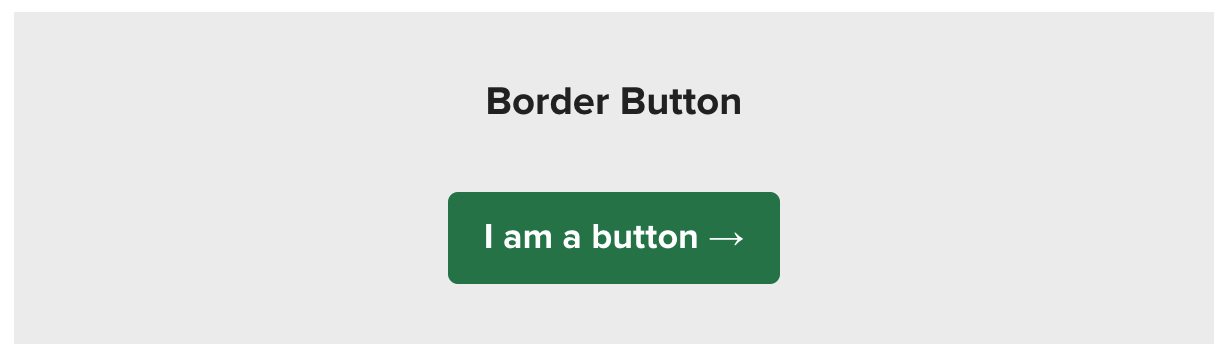
Border-based buttons take a similar approach to the previous method. Using simple HTML and CSS, you can structure and style your calls-to-action. However, instead of relying on padding on the table cell level for structure, add thick borders to the link itself to build your CTA.
<a rel="noopener" target="_blank" href="http://litmus.com" target="_blank" style="font-size: 18px; font-family: Helvetica, Arial, sans-serif; color: #ffffff; font-weight: bold; text-decoration: none; border-radius: 5px; background-color: #1F7F4C; border-top: 12px solid #1F7F4C; border-bottom: 12px solid #1F7F4C; border-right: 18px solid #1F7F4C; border-left: 18px solid #1F7F4C; display: inline-block;">I am a button →</a>
Note that the link tag is set to be a block-level element and that borders are used to provide “padding.” This ensures the entire button is hoverable and clickable, even in older desktop clients.
Pros of border-based buttons
- All styling is on the actual link tag, which simplifies the code.
- Only one button is used. No double buttons or confusing VML code needed.
- You don’t need specific height or width definitions, making buttons highly scalable.
Cons of border-based buttons
- Outlook reduces the size of the borders by a small amount.
- Outlook does not recognize <a> tags as block-level elements.
- Outlook doesn’t support rounded corners.
- There’s no ability to add more advanced styling such as extra borders on the exact link element.
5. Padding-and-border-based buttons
The padding-and-border-based buttons combine elements of the previous two approaches.
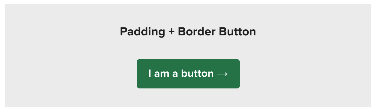
Essentially, this approach uses the same structure of styling the link with both padding and at least a solid 1px border. Then, a background color is applied to the <td> to fill the entire background of the link. The background color needs to be applied to the <td> instead of the <a> in this instance because Outlook doesn’t recognize horizontal padding on the <a> tag (since it doesn’t support such styling for non block-level HTML elements).
<table border="0" cellspacing="0" cellpadding="0">
<tr>
<td align="center" style="border-radius: 5px; background-color: #1F7F4C;">
<a rel="noopener" target="_blank" href="https://litmus.com" target="_blank" style="font-size: 18px; font-family: Helvetica, Arial, sans-serif; color: #ffffff; font-weight: bold; text-decoration: none;border-radius: 5px; padding: 12px 18px; border: 1px solid #1F7F4C; display: inline-block;">I am a button →</a>
</td>
</tr>
</table>
Pros of padding-and-border buttons
- Only one button needs to be coded, which makes buttons using this technique easy to update.
- Specific dimensions for the buttons are not required.
- Background images can be supported with this method.
Cons of padding-and-border buttons
- Styling is separated between a <td> and <a>, so both need to be updated when there are changes in style for the button.
- Outlook doesn’t support rounded corners.
Semantic HTML email buttons?
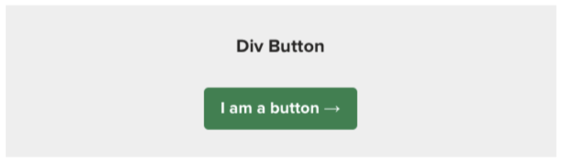
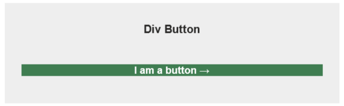
We love using semantic html, but unfortunately, the <button> tag is just not supported in email. It’s reduced to a <div> in most email clients, which is either not clickable or not rendered correctly.
Nesting divs or tables inside your anchor tags can be done. But it’s not semantically correct. Also, both of these methods result in buttons that don’t work in Outlook. In the case of tables, the link isn’t clickable, and in the case of divs… well, see for yourself:
| Div button | Div button in Outlook |
|---|---|
 |  |
Advanced bulletproof button hacks and enhancements
All of the above methods are great starting points in creating bulletproof buttons, but each technique can be further modified to create better bulletproof buttons.
Horizontal padding hack for Outlook
Outlook doesn’t support horizontal padding, which can result in your CTA email text being very close to the left and right edges of your bulletproof button.
A quick hack that can be used to increase the horizontal “padding” for Outlook is to conditionally add inline, non-breaking space(s) on each side of the link. The conditional padding button already makes use of this along with the letter-spacing property to add space on the sides of the button.
<!--[if mso]> <![endif]-->
Progressive enhancement with media queries
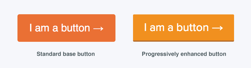
To improve the design of your bulletproof button, you can use advanced styling like borders, gradients, web fonts, hover effects, and more with media queries.
Outlook enhancements with VML
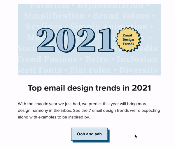
If you want to make your buttons really shine, you can dive into VML to add a little pizazz to your buttons.
As frustrating as VML can be, it allows you to create buttons with background images and gradients as well as shadows. There’s definitely a degree of trial and error, but the results can be stunning.
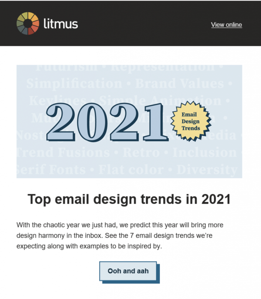
Check out the button from our January 2021 newsletter for an example:
What does email client support look like?
Email clients have updated their support since this post was first written in 2017, so these buttons are very close to bulletproof. The least amount of support is in Outlook but even there, the buttons are still functional.
You can check out the full Litmus tests here.
| Email Client | Conditional | VML | Padding | Border | Padding + Border |
|---|---|---|---|---|---|
| Apple Mail | ✔ | ✔ | ✔ | ✔ | ✔ |
| Lotus Notes | ✘ | ✘ | ✔ | ✔ | ✔ |
| IBM Notes 10 | ✘ | ✘ | ✔ | ✔ | ✔ |
| Outlook 2007-2016 | ✔* | ✔ | ✔* | ✔*† | ✔* |
| Outlook for Mac | ✔ | ✔ | ✔ | ✔ | ✔ |
| Office365 (desktop) | ✔* | ✔ | ✔* | ✔*† | ✔* |
| Gmail | ✔ | ✔ | ✔ | ✔ | ✔ |
| AOL | ✔ | ✔ | ✔ | ✔ | ✔ |
| Yahoo | ✔ | ✔ | ✔ | ✔ | ✔ |
| Outlook 365 (webmail) | ✔ | ✔ | ✔ | ✔ | ✔ |
| Outlook.com | ✔ | ✔ | ✔ | ✔ | ✔ |
| Mail.ru | ✔ | ✔ | ✔ | ✔ | ✔ |
| GMX.de | ✔* | ✔ | ✔* | ✔* | ✔* |
| T-Online.de | ✔† | ✔ | ✔ | ✔ | ✔ |
| Web.de | ✔* | ✔ | ✔* | ✔* | ✔* |
| Gmail App (Android) | ✔ | ✔ | ✔ | ✔ | ✔ |
| Gmail App (iOS) | ✔ | ✔ | ✔ | ✔ | ✔ |
| iPhone/iPad | ✔ | ✔ | ✔ | ✔ | ✔ |
| Samsung Mail | ✔ | ✔ | ✔ | ✔ | ✔ |
| Outlook (Android) | ✔ | ✔ | ✔ | ✔ | ✔ |
| Outlook (iOS) | ✔ | ✔ | ✔ | ✔ | ✔ |
| Dark Mode | |||||
| Apple Mail | ✔ | ✔ | ✔ | ✔ | ✔ |
| Gmail App | ✔ | ✔ | ✔ | ✔ | ✔ |
| iPhone/iPad | ✔ | ✔ | ✔ | ✔ | ✔ |
| Office 365 (desktop) | ✔ | ✘ | ✔ | ✔ | ✔ |
| Outlook.com | ✔ | ✔ | ✔ | ✔ | ✔ |
* Rounded corners do not render. † Button size is distorted.
Support and hacks for Dark Mode
Dark Mode brings an interesting twist to bulletproof buttons. Like most HTML and CSS, you can control the Dark Mode styles for buttons with media queries.
However, Gmail and Outlook.com can invert the button colors.
If you want to retain the background colors on your buttons, there are some hacks. Watch out for inverting the color of the copy on the buttons, though. There’s no way to keep your font colors from switching in Outlook, but you can keep white text on your buttons with Rémi Parmentier’s CSS blend workaround.
The biggest lack of support in these bulletproof button options is the VML buttons.
In Dark Mode, Office 365 will invert your background colors, but it won’t invert the fill color in the VML. So you end up with buttons that look like this:

To fix this this: Make sure to use the RGBA value for the background color on the <a> tag for your button, like so:
<div>
<!--[if mso]>
<v:roundrect xmlns:v="urn:schemas-microsoft-com:vml" xmlns:w="urn:schemas-microsoft-com:office:word" rel="noopener" target="_blank" href="http://" style="height:50px;v-text-anchor:middle;width:170px;" arcsize="10%" stroke="f" fillcolor="#1F7F4C">
<w:anchorlock/>
<center>
<![endif]-->
<a rel="noopener" target="_blank" href="http://litmus.com" style="background-color:rgba(31, 127, 76,1);border-radius:5px;color:#ffffff;display:inline-block;font-size: 18px; font-family: Helvetica, Arial, sans-serif;font-weight:bold;line-height:50px;text-align:center;text-decoration:none;width:170px;-webkit-text-size-adjust:none;">I am a button →</a>
<!--[if mso]>
</center>
</v:roundrect>
<![endif]-->
</div>
You end up with a button that looks like this instead (much better, right?):

The RGBA value as a background color isn’t supported in Outlook, so it falls back to the VML color. Thanks to Wilbert Heinen for this fix! As we can’t control the font color in Dark Mode in Outlook, if you’re going to use this button, make sure your color choices account for accessibility when your font color is reversed as well. (This example shows what colors not to use.)
Are your campaigns bulletproof?
Regardless of which approach you take, using bulletproof buttons for calls-to-action is vastly superior to relying on images. Even in email clients that block images, bulletproof buttons ensure your message will be clear to your audience, increasing the likelihood of your subscribers engaging. No more broken emails!
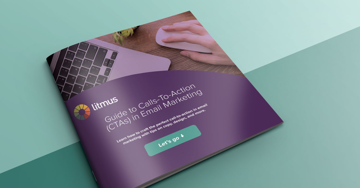
| Get CTA copy examples for your own emails Want power words and example scenarios to help you craft your most effective, email CTA? Grab them in our Guide to Calls-To-Actions (CTAs) in Email Marketing. |
Carin Slater
Carin Slater is the Email and Content Growth Marketing Manager at Litmus
 Blog
Blog 